Data visualization as a service redefines how modern enterprises unlock the hidden potential of raw information, transforming static numbers into dynamic, living stories that guide executive action. Across corporate landscapes, organizations are breaking free from the heavy anchors of permanent, on-premise reporting servers, opting instead to lease nimble cloud-hosted visual dashboards that breathe new life into corporate financial forecasting and strategic planning.
This monumental shift eliminates unpredictable capital expenditures, replacing them with predictable operational expenses that empower venture-backed startups and retail giants alike to navigate volatile markets with absolute clarity and unmatched velocity.
By leveraging zero-footprint browser streaming, automated aesthetic governance engines, and real-time collaborative workspaces, companies ensure that decision-makers receive immediate graphical intelligence anywhere in the world. Edge computing nodes and custom semantic mapping layers further bridge the gap between complex database architectures and non-technical teams, fostering a culture of shared insight. As businesses continue to embrace these elastic subscription models, they secure a profound competitive advantage built on seamless connectivity, stunning visual clarity, and unwavering precision.
Organizations now rent cloud-hosted visual dashboards instead of building permanent internal reporting servers from scratch
Source: sumatosoft.com
Modern enterprises are shifting away from heavy capital expenditure models, choosing instead to lease agile cloud infrastructure for executive analytics. This strategic evolution redefines how operational intelligence is consumed, prioritizing flexibility and immediate scalability over rigid hardware ownership.
Renting cloud-hosted dashboard infrastructure fundamentally revolutionizes corporate financial forecasting by replacing capital-intensive hardware investments with predictable, scalable operational expenditures. Traditional forecasting models often rely on fragmented spreadsheets that require manual consolidation, introducing latency and human error into critical budgetary decisions. When organizations transition to subscription-based visual portals, financial analysts gain real-time access to automated data pipelines that ingest inputs from enterprise resource planning systems and point-of-sale terminals simultaneously.
This continuous data integration allows predictive algorithms to run complex Monte Carlo simulations and variance analyses on elastic cloud clusters without straining local machines. For instance, multinational retail chains like Target and Walmart leverage elastic visualization rented environments to adjust inventory budgets dynamically during high-volume periods such as Black Friday. Instead of provisioning physical servers that sit idle during off-peak months, these corporations dynamically scale their cloud dashboard capacity up or down, ensuring that forecasting accuracy scales directly with business velocity while safeguarding cash flow.
Operational Migration Procedures for Subscription Visual Portals
Moving away from legacy spreadsheet silos demands a disciplined, step-by-step transition protocol to ensure data integrity and user adoption across departments. Executing this migration safely requires mapping existing data architectures directly into modern, cloud-native semantic layers.
- Conduct a comprehensive data audit to identify all mission-critical static spreadsheets, macro-enabled workbooks, and orphaned reporting files currently operating across business units.
- Establish standardized data governance rules and centralized schemas within a secure cloud data warehouse like Snowflake or Google BigQuery before connecting any visualization tools.
- Configure secure application connectors and automated API gateways to bridge legacy SQL databases with the chosen cloud-hosted business intelligence subscription platform.
- Rebuild core financial models and operational scorecards using modern visualization design principles, replacing static tables with interactive, filterable visual canvases.
- Implement rigorous role-based access control protocols and execute comprehensive employee training workshops to ensure seamless adoption of the new digital reporting ecosystem.
Every phase of this migration acts as a vital bridge, turning chaotic personal archives into an institutional asset that empowers immediate executive action.
Reduction of Server Maintenance Overhead via Ephemeral Visual Nodes
Mid-sized retail enterprises face immense pressure to keep digital storefronts and analytical reporting tools running continuously without maintaining massive, dedicated IT departments. Ephemeral visual nodes solve this challenge by spinning up analytical environments precisely when queries are executed and terminating them immediately afterward. This ephemeral architecture eliminates the need for internal teams to patch operating systems, manage physical cooling units, or manually upgrade database drivers on local rack servers.
When an analyst queries last quarter’s sales performance, temporary computing containers process the request in the cloud and disappear, reducing power consumption and hardware depreciation costs significantly. Industry data from Gartner indicates that mid-market retailers adopting serverless visualization architectures reduce their total cost of ownership by nearly forty percent over a three-year period. By outsourcing the physical and virtual maintenance burdens to top-tier cloud providers, internal technology staff can redirect their energy toward strategic customer-facing digital innovations.
Cloud dashboard rental transforms capital expenses into flexible operational agility, empowering data-driven decisions without infrastructure friction.
Comparative Analysis of Visualization Licenses and Cloud Rental Contracts
Evaluating the true cost and operational impact of reporting infrastructure requires a direct examination of traditional on-premise software licensing versus modern cloud subscription models. The following table contrasts these two paradigms across critical enterprise dimensions.
| Evaluation Metric | On-Premise Visualization Licenses | Cloud Rental Contracts |
|---|---|---|
| Initial Capital Outlay | Extremely high costs for physical servers, server racks, and perpetual enterprise software licenses. | Zero hardware costs; immediate access via low-cost monthly or annual subscription fees. |
| Scalability and Elasticity | Rigid and slow; scaling up requires purchasing, shipping, and installing additional hardware components. | Instantaneous and automated; capacity scales dynamically based on real-time query demands. |
| Maintenance Responsibility | Handled entirely by internal IT staff through manual patching, hardware repairs, and upgrades. | Managed seamlessly by the cloud service provider with zero internal downtime required. |
| Disaster Recovery | Complex and expensive to set up redundant physical data centers for emergency failover protection. | Built-in global redundancy, automated backups, and instant multi-region disaster recovery protocols. |
This structural contrast highlights why modern enterprises increasingly abandon physical server rooms in favor of agile, cloud-native analytical partnerships.
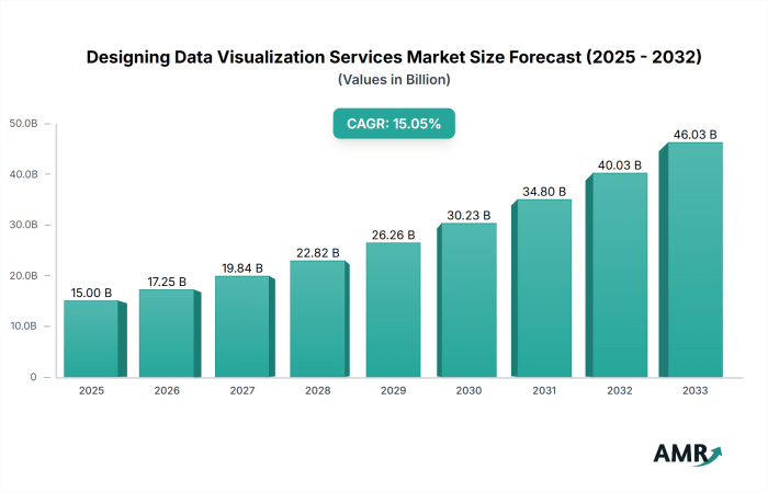
Modern executives require immediate graphical intelligence delivered directly through browser streams without local software installations
Source: datainsightsmarket.com
The modern boardroom operates at the speed of global market shifts, demanding absolute clarity without the administrative friction of legacy software deployments. When sudden supply chain disruptions or macroeconomic shocks ripple across international markets, decision-makers cannot afford to wait for IT departments to provision local reporting environments or patch desktop visualization clients. Instead, leadership teams now rely on instantaneous graphical intelligence streamed natively into standard web browsers, transforming static corporate oversight into a fluid, highly responsive discipline.
Zero-footprint browser streaming fundamentally alters corporate decision-making velocity during high-stakes crisis meetings by eliminating the traditional latency associated with data extraction, local file rendering, and software compatibility checks. In a traditional reporting model, assembling a cross-functional crisis response team meant compiling disparate CSV exports, running local queries, and distributing static PDF slide decks that were outdated the moment they left the compiler’s desk.
Today, cloud-hosted visualization engines process massive terabytes of live operational metrics at the server edge, compressing the computational burden and transmitting only the dynamic visual layer directly to the executive’s device. This architectural leap means that when a sudden logistics bottleneck threatens quarterly margins at midnight, executives are not squinting at static spreadsheets. They are interacting with live, synchronized heat maps and predictive inventory depletion curves that update in real-time as new shipping manifests clear customs in Singapore and Rotterdam.
Data visualization as a service transforms chaotic metrics into vibrant, crystal-clear operational landscapes. By examining every dock scheduling system data model entities fields warehouse management , logistics teams uncover hidden bottlenecks through brilliantly illuminated dashboards. This profound clarity empowers businesses to accelerate daily workflows and brilliantly chart a course toward unprecedented future success through actionable visual insights.
The absence of local installation requirements ensures that newly appointed board members or external restructuring consultants can securely join a live telemetry stream with a single authenticated URL click, cutting onboarding and alignment friction from hours down to seconds. By removing the technical barriers between raw enterprise data and human cognition, organizations achieve a state of continuous situational awareness where strategic pivots occur while the crisis is unfolding, rather than during the post-mortem analysis weeks later.
Secure Pixel Transmission Architecture for Executive Mobile Devices
Delivering high-fidelity analytical dashboards to executive tablets outside the corporate perimeter requires an uncompromising security framework that protects sensitive business intelligence without sacrificing rendering performance. Rather than sending raw enterprise databases or intermediate query results to the local device—which introduces severe data leakage vulnerabilities—modern visual streaming services execute all data processing, aggregation, and rendering within isolated cloud containers. The resulting graphical output is systematically partitioned into lightweight, encrypted pixel tiles or streamed as an adaptive video stream using advanced codecs like H.264 or AV1.
Every single frame is encrypted at the source using robust transport layer security before traversing the public internet, ensuring that interceptors capture nothing more than randomized noise. Authentication relies heavily on decentralized, context-aware identity verification protocols. Before a single pixel stream initiates, the executive’s tablet must pass multi-factor authentication enforced by hardware-backed cryptographic keys, alongside continuous behavioral analysis that monitors device posture, network reputation, and geographical telemetry.
If an executive accesses a confidential financial dashboard from an unsecured public Wi-Fi network while traveling, the streaming gateway dynamically degrades non-essential data layers or applies strict digital watermarking directly into the pixel stream to deter unauthorized screen captures. This sophisticated delivery mechanism guarantees that corporate intellectual property remains strictly confined within the secure cloud perimeter, satisfying the rigorous compliance mandates of financial regulators and defense contractors alike.
The operational reality of this technology is vividly demonstrated when corporate leadership must navigate unforeseen global events while physically in transit across international airspace. Consider the scenario of Chief Executive Officer Elena Vance as she boards a transatlantic flight from New York to London, moments before a critical, unscheduled emergency briefing regarding an unexpected hostile takeover bid and a sudden currency devaluation in Latin American markets.
Seated in the aircraft cabin just as the boarding bridge retracts, Elena connects her tablet to the airline’s high-speed satellite Wi-Fi network. Without installing any proprietary enterprise software or configuring complex virtual private network tunnels, she opens her standard browser and navigates to the secure corporate intelligence portal. Authenticated instantly via her biometric hardware token, her browser immediately initiates an encrypted pixel stream originating from the company’s secure cloud visualization cluster in Virginia.
As the aircraft taxies toward the runway, a high-resolution, interactive graphical dashboard materializes across her screen, displaying live cash-flow burn rates, regional stock accumulation metrics, and real-time algorithmic threat probabilities. While the jet ascends through the turbulent cloud layer, Elena uses her touchscreen to pinch, zoom, and manipulate a predictive liquidity model, evaluating the precise impact of various defensive capital allocation strategies.
She collaborates seamlessly with her chief financial officer, who is viewing the identical streamed visual state from a corporate office in Frankfurt, annotating the live charts with voice-over IP communications. By the time the aircraft reaches cruising altitude over the Atlantic, the strategic decision to execute a defensive share buyback has been modeled, verified, and authorized—all driven by browser-streamed graphical intelligence that left zero local footprint on her mobile device.
Safeguarding streamed graphical telemetry against sophisticated cyber threats and unauthorized interception demands a multi-layered cryptographic foundation that operates invisibly beneath the user interface. The integrity, confidentiality, and authenticity of every transmitted pixel and metadata packet rely on a standardized suite of robust security protocols.
- Transport Layer Security 1.3 protocol implementation, which enforces perfect forward secrecy and eliminates vulnerable legacy cipher suites during the initial executive handshake.
- JSON Web Token validation mechanisms, cryptographically signed with asymmetric RSA-4096 algorithms to verify session authenticity and prevent token forgery or replay attacks.
- Advanced Encryption Standard 256-bit encryption applied directly to the dynamic graphical payload, securing the visual data stream from the cloud rendering engine down to the browser decoding buffer.
- Public Key Infrastructure integration utilizing hardware security modules to manage device-specific client certificates and enforce strict mutual authentication before stream authorization.
- Secure WebSockets protocol framing, ensuring bidirectional, stateful communication channels are continuously protected against man-in-the-middle injection and cross-site scripting vulnerabilities.
Visual streaming is not merely a method of delivering pixels to a screen; it is the fundamental infrastructure of executive agility, transforming raw data into an immediate, secure cognitive extension of leadership.
Subscription billing models for graphical intelligence shift technology budgets from unpredictable capital outlays to predictable operational expenses
Modern enterprises no longer need to gamble massive chunks of capital on physical reporting servers that depreciate the moment they are unboxed. Instead, the landscape of corporate analytics has evolved into a sleek, utility-driven ecosystem where clarity is delivered on-demand. This financial metamorphosis changes how companies allocate resources, turning heavy infrastructural anchors into light, manageable operational currents.
For venture-backed startups operating in high-stakes environments, managing cash flow is the ultimate survival metric. Traditional software deployment forced founders to drain reserves on massive upfront licenses and server racks before even validating their core product market fit. Subscription billing models for graphical intelligence completely rewrite this playbook by replacing jarring capital outlays with smooth, predictable monthly invoicing. When a startup knows down to the exact dollar what its data visualization tools will cost each month, financial planning transforms from a stressful guessing game into a precise science.
This consistent cadence frees up vital liquidity, allowing founders to reinvest early capital directly into high-growth areas like product engineering and customer acquisition rather than hoarding cash for unexpected IT failures. Furthermore, predictable expenses eliminate the dreaded year-end budget crunches that historically crippled emerging enterprises just as they were gaining commercial momentum. By smoothing out the financial trajectory, startups can confidently pitch venture capitalists with clean balance sheets and highly reliable burn-rate projections.
Auditing fluctuating tier-based pricing structures for global user bases
As organizations scale across international borders, keeping track of decentralized analytics consumption can quickly become a logistical maze. Global user expansion introduces dynamic licensing tiers that naturally fluctuate based on active regional nodes, timezone shifts, and departmental data demands. To maintain absolute fiscal discipline, finance and IT operations teams must establish rigorous auditing protocols that monitor real-time consumption data against contracted tier limits.
This involves deploying automated tracking scripts that flag sudden spikes in viewer counts across distinct geographic zones before those surges trigger unexpected overage penalties on the monthly invoice. Regular reconciliation meetings between department heads and cloud procurement specialists ensure that dormant accounts are promptly pruned while high-performing teams receive the bandwidth they require. By treating cloud visualization licenses as living, breathing assets, enterprises prevent shadow IT expenditures and maintain crystal-clear visibility over their global software footprint.
The operational framework for auditing these global visualization tiers relies on a structured sequence of checks and balances that protect both the corporate budget and end-user productivity. The following protocol Artikels the necessary sequential phases for maintaining seamless tier-based governance:
- Deploy automated telemetry tools at regional gateways to capture live concurrent viewer metrics without interrupting browser-stream performance.
- Cross-reference monthly active user logs against department-allocated software budgets to identify regional discrepancies or unauthorized license sharing.
- Engage in quarterly tier-optimization reviews with cloud vendor account managers to right-size subscription brackets ahead of anticipated seasonal business rushes.
Psychological comfort of elastic software subscriptions over hardware depreciation, Data visualization as a service
Walking into a server room used to give corporate Chief Financial Officers a profound sense of tangible ownership, but it also delivered constant anxiety over impending hardware obsolescence. Every physical component purchased was a ticking clock, destined to lose value rapidly while demanding expensive maintenance contracts and climate-controlled real estate. Transitioning to elastic software subscriptions provides a remarkable psychological liberation for modern financial leaders who are eager to shed the burdens of physical asset management.
Instead of worrying about sudden motherboard failures or out-of-warranty replacements, executives find deep comfort in the agility of an elastic cloud model that scales effortlessly up or down with market conditions. If global demand dips, the subscription shrinks accordingly without leaving behind heaps of worthless scrap metal or cumbersome depreciation schedules that complicate tax season. This shift empowers CFOs to view technology not as a depreciating liability, but as a flexible utility that powers immediate strategic insights.
Predictable monthly operational expenses replace the anxiety of capital depreciation, allowing financial leaders to fund innovation with absolute peace of mind.
The financial transition from physical hardware liabilities to agile cloud subscriptions is vividly illustrated through scalable pricing architectures designed to accommodate fluctuating enterprise demands without locking companies into rigid, permanent infrastructure contracts.
Data visualization as a service transforms chaotic numbers into luminous, crystal-clear insights that empower modern enterprises. As organizations build their digital identities, downloading a sharp doorloop logo png anchors brand recognition during major corporate presentations. Ultimately, leveraging these dynamic visual analytics tools elevates your strategic planning, illuminating a bright path toward unprecedented business growth and operational excellence.
| Subscription Tier | Concurrent Active Viewers | Monthly Operational Cost | Billing Flexibility |
|---|---|---|---|
| Starter Intelligence | Up to 50 Viewers | $1,500 | Month-to-Month |
| Growth Analytics | Up to 250 Viewers | $5,500 | Quarterly Adjustments |
| Enterprise Stream | Up to 1,000 Viewers | $18,000 | Dynamic Scaling |
| Global Command | Unlimited Viewers | Custom Enterprise Rate | Annual True-Up |
Automated aesthetic governance engines enforce strict corporate branding guidelines across thousands of decentralized remote displays.

Source: cloudfront.net
In the fast-paced theater of modern global enterprise, maintaining a unified visual identity across a sprawling digital landscape is no small feat. Modern corporate ecosystems stretch across continents, linking remote branch offices, bustling regional headquarters, and digital-first teams through a continuous stream of cloud-hosted dashboards. Within this interconnected reality, the integrity of a brand’s visual presentation can easily fracture under the weight of decentralized content creation.
Automated aesthetic governance engines step into this operational arena as silent digital sentinels, safeguarding the visual reputation of the enterprise by rigorously enforcing corporate design standards across thousands of remote displays without missing a single pixel.
Algorithmic color harmony acts as the foundational immune system against chaotic visual presentations scattered across global branch offices. When hundreds of localized teams independently generate reporting charts, the natural human tendency toward diverse aesthetic preferences threatens to devolve executive displays into an unprofessional mosaic of clashing hues and unreadable contrast ratios. Advanced color governance algorithms intercept incoming visualization data streams, evaluating palette selections against WCAG accessibility standards and strict corporate style matrices in milliseconds.
Data visualization as a service transforms raw metrics into vibrant, crystal-clear canvases that spark immediate insight. Exploring zityhub.com product overview insights reveals groundbreaking tools designed to illuminate hidden corporate trends and accelerate smart decision-making. Harnessing this dynamic analytical power ultimately elevates data visualization as a service into an indispensable engine for continuous organizational growth and modern business success.
By mathematically calculating perceptual uniformity and luminance curves, these systems dynamically recalibrate saturation and hue values on the fly. This automated intervention ensures that a sales metric rendered in Tokyo matches the precise hex code and visual weight of the same metric viewed in London or New York, eradicating visual dissonance and preserving executive trust through mathematically verified chromatic balance.
Automated Script Procedures for Design Compliance
Behind the seamless interface of cloud-hosted business intelligence lies a rigorous defensive framework designed to neutralize non-compliant chart designs generated by rogue departmental units. When an autonomous regional team attempts to publish a visualization featuring unauthorized neon gradients, unapproved typography, or illegible 3D bar effects, automated script procedures immediately intercept the request at the API gateway. These backend governance scripts execute deterministic validation rules that scan the Document Object Model of the chart payload against a cryptographically secured master design schema.
If a variance is detected, the governance engine does not merely reject the asset; it actively triggers an intelligent refactoring protocol. The script strips away rogue formatting classes, strips unapproved font families, and injects standardized CSS variables and layout flex-boxes that force the rogue chart into strict structural compliance before it ever renders on a glass screen.
To encapsulate the philosophical shift from manual design policing to autonomous mathematical enforcement, modern enterprises rely on codified manifestos that bridge human creative intent with machine-readable execution. The following directive translates brand identity directly into computable logic for continuous deployment across global data streams.
“An enterprise brand is no longer a static PDF manual collecting digital dust; it is a living, executable API of design tokens. Every hue, spacing metric, and typographic scale must be compiled directly into runtime style sheets that reject non-conformity at the algorithmic gate, ensuring that institutional trust is never compromised by decentralized creative impulse.”
Ensuring that thousands of remote screens maintain absolute fidelity to the corporate design system requires continuous, multi-dimensional tracking of visual parameters. The operational health of the enterprise display network is measured through precise rendering metrics that evaluate both structural integrity and aesthetic compliance across heterogeneous hardware environments.
- Color Contrast Variance: Measures the mathematical luminance difference between text elements and data backgrounds to guarantee effortless readability across varied display lighting conditions.
- Typography Hierarchy Adherence: Tracks the precise scaling ratio of header tags and data labels to prevent rogue departments from utilizing unauthorized font weights or proprietary families.
- Grid Alignment Precision: Evaluates the pixel-level snap of chart containers against the master layout grid to eliminate visual jitter during real-time data streaming updates.
- Asset Token Synchronization: Monitors the latency between master design system updates in the central cloud repository and their automated propagation to remote branch office displays.
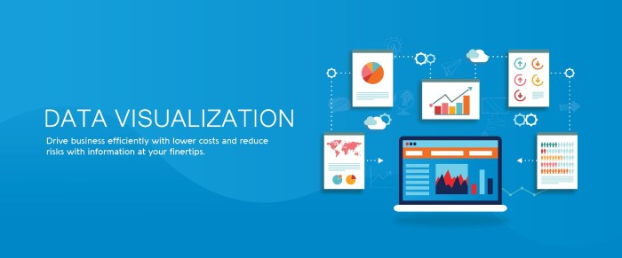
Collaborative visual workspace environments allow geographically fragmented teams to annotate live charts simultaneously during video conferences.
Source: serole.com
Modern distributed enterprises operate across blurred time zones and disparate continents, yet they must maintain the cognitive velocity of a team sitting together in a single war room. The evolution of cloud-hosted graphical environments has transformed passive screen sharing into an active, multi-dimensional arena where remote colleagues touch, mark, and manipulate the exact same pixels in real time. This seamless integration of video communication and synchronized canvas interaction eliminates the traditional friction of static slide decks and delayed email attachments, forging a unified operational reality.
The convergence of high-speed browser protocols and distributed state management enables simultaneous multi-user cursor tracking, fundamentally reshaping how geographically isolated engineering squads reach strategic alignment. When half a dozen specialists spread across Tokyo, Berlin, and San Francisco stare at the same complex telemetry stream, seeing each other’s color-coded pointer glide across the interface creates a profound psychological sense of presence.
This spatial awareness drastically accelerates consensus-building by mirroring the non-verbal cues of an in-person whiteboard session. Instead of verbally describing a problematic anomaly in a telemetry spike, an engineer simply drops a visual marker onto the coordinate, instantly drawing the collective focus of the entire virtual room. This reduction in cognitive load cuts through linguistic ambiguities and technical jargon, allowing multidisciplinary teams to diagnose bottlenecks, debate architectural trade-offs, and ratify deployment strategies in minutes rather than days.
Data visualization as a service transforms raw metrics into luminous landscapes of actionable insight, guiding modern enterprises toward unprecedented growth. As organizations rigorously evaluate security platforms like dash.fi vs clickgaurd to protect their digital assets, clear visual analytics remain essential for measuring strategic success. Ultimately, this vibrant clarity empowers leaders to decode complex performance data and illuminate tomorrow with absolute confidence.
The psychological validation of watching peers react to a highlighted data point in real time builds immediate trust and shared ownership over complex decisions.
Simultaneous visual annotation converts fragmented remote discussions into cohesive operational momentum, compressing days of email chains into moments of shared clarity.
Real-Time Data Synchronization and Conflict Resolution Mechanics
Maintaining absolute integrity across a shared financial scatter plot while multiple users alter parameters requires sophisticated underlying architecture that operates invisibly beneath the graphical interface. State synchronization relies on operational transformation and conflict-free replicated data types, ensuring that if two analysts modify axis thresholds or add regression filters at the exact same millisecond, the cloud server reconciles the inputs deterministically without crashing the visualization stream.
Every user action is translated into a lightweight cryptographic JSON payload transmitted via WebSocket connections, instantly updating the central document tree and broadcasting the delta state to all connected nodes. Latency compensation algorithms predict cursor trajectories and smooth out micro-stutters, creating an illusion of instantaneous local execution even when participants experience variable network speeds. Security and permission matrices govern these interactions, restricting raw data modifications to authorized roles while allowing junior team members to apply temporary visual overlays and annotations that layer cleanly over the foundational dataset.
Imagine a high-stakes emergency session inside a multinational consumer electronics firm facing a severe supply chain bottleneck originating from a key semiconductor fabrication plant in Southeast Asia. The supply chain director in London projects a dense, color-coded scatter plot mapping component delivery delays against financial penalty costs across a synchronized browser canvas. Simultaneously, the lead procurement officer in Singapore points a glowing teal cursor directly at an outlier cluster representing a stalled cargo shipment in the Malacca Strait, dropping a digital pin with an embedded cost overrun calculation.
Across the Atlantic, the chief operations officer in Chicago watches the marker appear in real time, grabs a drawing tool to circle an alternative shipping route through a secondary port, and instantly recalculates the projected logistics timeline. As they converse through integrated video feeds, the shared canvas responds fluidly to their concurrent inputs, instantly filtering out non-essential inventory metrics and highlighting high-risk nodes.
The visual workspace acts as a single source of truth, absorbing conflicting proposals and merging them into a unified remediation plan without a single version control error or delayed refresh cycle.
| Evaluation Metric | Asynchronous Feedback Loops | Real-Time Graphical Collaboration | Operational Impact |
|---|---|---|---|
| Decision Velocity | Hours or days spent exchanging marked-up PDF exports and email threads. | Minutes achieved through simultaneous multi-cursor interaction on live feeds. | Accelerates crisis response and reduces market entry latency by up to seventy percent. |
| Version Integrity | High risk of conflicting local file edits and outdated spreadsheet versions. | Guaranteed single source of truth managed via cloud-hosted state synchronization. | Eliminates costly errors caused by teams reviewing mismatched operational metrics. |
| Contextual Clarity | Explanations restricted to rigid text comments detached from visual data points. | Direct spatial annotations anchored precisely to chart coordinates and axes. | Improves comprehension across diverse technical and executive stakeholder groups. |
| Engagement Quality | Fragmented participation with low accountability and delayed cognitive buy-in. | High immersion through synchronized video streams and active cursor tracking. | Fosters stronger team cohesion and decisive consensus among remote personnel. |
Edge computing nodes process heavy visual rendering tasks locally before transmitting lightweight interactive payloads to end-user devices.
Modern visual intelligence no longer relies entirely on distant cloud servers buried deep within faraway data centers. By distributing calculation power closer to the point of consumption, decentralized networks transform how visual dashboards behave on everyday pocket-sized technology. This architectural evolution bridges the physical gap between heavy computational mathematics and real-time human interaction, rewriting the rules of digital responsiveness.
Shifting heavy mathematical rendering to edge servers eliminates latency on mobile phones by fundamentally altering how pixel geometry travels across digital networks. Traditional reporting workflows demand that a handheld smartphone transmits raw query parameters to a centralized mainframe, which then calculates complex polygon matrices, rasterizes thousands of data points into a heavy bitmap image, and streams the bulky result back down the line.
When network congestion hits or cellular towers experience interference, this round-trip creates agonizing multi-second delays that frustrate mobile professionals. Edge computing shortens this journey dramatically. Localized micro-data centers stationed at cellular base stations or regional fiber hubs intercept the visualization request and shoulder the crushing computational burden of vector calculations and shader processing. Instead of forcing a mobile phone processor to struggle with millions of simultaneous graphic vectors, the edge node does the heavy lifting right at the network perimeter.
It computes the complex geometry locally and streams only a compressed, lightweight stream of interactive vector coordinates or video frames to the handheld device. Because the payload sent to the phone consists solely of optimized, featherlight instructions rather than heavy graphical assets, user interface responsiveness matches the fluidity of native applications. The mobile phone acts purely as an intelligent canvas, reacting instantly to touch gestures while the edge cluster handles the invisible mathematical storm humming silently in the background.
Procedural handshakes between local mobile GPUs and remote rendering clusters
Managing sudden surges in graphical data requires an intricate, high-speed digital dialogue between the hardware sitting in a user’s hand and the micro-cluster waiting at the network edge. When a sudden data spike occurs—such as thousands of financial traders simultaneously zooming into a massive global asset map—a highly choreographed synchronization sequence begins in milliseconds. The local mobile graphics processing unit initiates the protocol by broadcasting an optimized hardware telemetry packet, detailing its current thermal state, battery threshold, decoding capabilities, and available screen refresh rate.
The remote rendering cluster ingests this hardware profile instantly, adjusting its level-of-detail algorithms to match the exact physical constraints of the smartphone screen. As the edge cluster processes the torrential influx of fresh database variables, it continuously compresses the resulting graphical frames using advanced video codecs like AV1 or H.265. Simultaneously, the mobile GPU sends micro-burst acknowledgments back to the edge node, confirming frame delivery success and reporting any micro-stutters detected during rapid scrolling gestures.
This constant bidirectional handshaking allows the edge cluster to dynamically throttle its rendering resolution on the fly, seamlessly trading visual fidelity for absolute frame-rate stability during peak network congestion periods.
Visualizing a high-stakes moment helps illustrate this machine-level choreography. Imagine a crowded stadium during a major sports broadcast where thousands of spectators query a live 3D heat map of player telemetry on their cellular devices. The local cell tower edge node detects a sudden traffic mountain, immediately allocates dedicated GPU slices for the specific cell sector, and lowers the rendering bitrate by ten percent for older phone models while maintaining pristine native resolution for flagship devices.
This dynamic resource allocation prevents network bottlenecks before they can form.
True low-latency visualization is not achieved by pushing faster raw data through bloated pipes, but by intelligently dividing cognitive labor between the edge of the network and the edge of human touch.
Bandwidth conservation enabling complex architectural schematics in remote deserts
Field technicians operating in extreme environments face severe connectivity constraints, often relying on erratic satellite links or single-bar cellular signals in vast, unpopulated landscapes like arid deserts. Viewing massive, multi-layered architectural schematics or 3D civil engineering models under these conditions used to be practically impossible due to crippling bandwidth caps and high packet loss. Edge computing nodes deployed in mobile trailers or integrated into regional telecom relay stations solve this geographic barrier through aggressive payload reduction.
Instead of downloading a two-gigabyte computer-aided design file onto a ruggedized field tablet, the technician views an interactive stream generated by an edge node stationed only a few miles away. The edge server renders the intricate blueprints locally, converting gigabytes of raw geometric data into lightweight, streamable graphical increments that require a fraction of standard bandwidth. Even when satellite connection speeds drop to dial-up levels, the technician can rotate, zoom, and inspect microscopic structural details of a remote solar farm installation without experiencing freezing screens or dropped connections.
This capability transforms remote operations, allowing engineers to make critical infrastructure decisions in the middle of harsh environments with the same visual clarity and speed as someone sitting in a metropolitan corporate headquarters.
Optimal hardware specifications for an edge rendering node
Deploying a high-performance edge rendering node requires a carefully balanced configuration of specialized hardware components designed to handle intense parallel computing workloads while maintaining energy efficiency in remote or modular environments. The following structural breakdown Artikels the baseline technical requirements needed to sustain real-time visual streaming operations.
- Central Processing Unit (CPU): A multi-core enterprise processor featuring at least 32 physical cores running at a base clock speed above 3.0 GHz to rapidly ingest, filter, and distribute incoming database queries before graphical rendering commences.
- Graphics Processing Unit (GPU): Dedicated server-grade graphics cards equipped with hardware-accelerated ray tracing cores, tensor cores, and a minimum of 48 gigabytes of high-bandwidth VRAM to process complex 3D rendering and real-time video encoding simultaneously.
- System Memory (RAM): A minimum of 256 gigabytes of error-correcting code memory to ensure absolute data integrity during massive parallel calculations and prevent memory leaks during extended visualization sessions.
- Storage Architecture: Enterprise-grade NVMe solid-state drives configured in a redundant array, delivering read and write speeds exceeding 7,000 megabytes per second to instantly load massive visual datasets into active memory.
- Network Interface: Dual-port 100-gigabit Ethernet adapters combined with specialized hardware offload processors to manage high-throughput streaming payloads and maintain ultra-low packet transit times across distributed remote displays.
Custom semantic mapping layers translate raw enterprise database tables into intuitive graphical metaphors tailored for non-technical workers
In the high-stakes arena of modern enterprise intelligence, raw data often speaks a foreign language that alienates the very decision-makers who need it most. Database administrators operate in clinical realms of foreign keys, normalized schemas, and string arrays, while marketing strategists think in terms of campaign momentum, customer sentiment, and quarterly conversions. This linguistic chasm historically required armies of data analysts to manually translate database queries into presentable slides.
Today, intelligent semantic layers act as real-time interpreters, transforming cold database nomenclature into vibrant visual narratives that empower every stakeholder to steer corporate strategy with absolute confidence.
Automated semantic translation fundamentally bridges the profound communication gap between meticulous database administrators and creative marketers by eradicating the friction of technical syntax. When a database administrator structures a relational table, column headings often appear as cryptic strings like ‘cust_id_fk_99’ or ‘trans_amt_net’. To a marketing professional crafting a customer retention campaign, these labels are completely opaque roadblocks. Semantic mapping layers intercept these raw database schemas and apply a contextual abstraction dictionary, converting foreign nomenclature into intuitive business concepts like Customer Identifier and Net Transaction Value.
Machine learning algorithms continuously analyze enterprise taxonomy, user interaction histories, and domain-specific glossaries to dynamically enrich metadata. Consequently, when a marketer opens a cloud-hosted dashboard, they no longer need to decipher database architecture or write complex Structured Query Language scripts. The system automatically reconciles the rigid logic of relational databases with the fluid, narrative-driven requirements of commercial execution. Database administrators are liberated from endless ad-hoc report requests, while marketing teams gain instant, self-service access to pristine graphical intelligence.
This seamless alignment accelerates campaign deployment, eliminates costly misinterpretations of consumer metrics, and fosters a unified organizational language where technical precision and commercial creativity finally speak as one.
“Semantic translation does not merely simplify data; it democratizes organizational truth by turning database architecture into a universally understood commercial language.”
Procedural pipeline for training automated chart recommendation classifiers
Deploying machine learning models to accurately suggest optimal chart types for raw numerical arrays requires a rigorous, multi-stage engineering pipeline designed to evaluate both mathematical properties and contextual intent. Engineers must transform abstract numbers into actionable visual recommendations through systematic data preparation and algorithmic refinement.
- Raw numerical arrays and categorical strings are ingested from enterprise data warehouses, followed by automated feature extraction that calculates statistical properties such as cardinality, variance, skewness, and temporal periodicity.
- Data scientists curate a comprehensive training corpus by labeling historical dashboard configurations, pairing specific dataset profiles with the chart types that ultimately yielded the highest user engagement and comprehension scores.
- Supervised classification algorithms, such as gradient-boosted decision trees and random forests, are trained on this historical corpus to recognize patterns connecting statistical data signatures to specific visual formats.
- Continuous validation loops assess the deployed classifier against live user interactions, measuring whether analysts accept the system’s automated chart suggestions or manually override them for alternative visual metaphors.
Cognitive psychology principles governing visual shape assignment
Translating abstract logistical variables into meaningful visual shapes is not an arbitrary design choice, but a precise science rooted in human cognitive psychology and visual perception theory. When executives scan complex operational dashboards, their brains unconsciously rely on innate perceptual heuristics to process spatial arrangements, geometric forms, and color gradients.
Gestalt psychology dictates that the human visual cortex naturally groups elements that share proximity, similarity, or closure. Therefore, assigning continuous line charts to time-series logistical variables leverages the principle of good continuation, allowing the human eye to effortlessly trace upward or downward trends across months without cognitive fatigue. Conversely, discrete categorical variables, such as regional warehouse capacities or product inventory tiers, are mapped to distinct geometric bars or proportional area shapes.
This structural differentiation prevents cognitive overload by respecting the brain’s dual-channel processing capacity, which handles verbal and visual information through separate mental pathways. By aligning digital dashboard interfaces with these deeply ingrained neurological wiring patterns, modern visualization platforms reduce time-to-insight and ensure that critical logistical warnings are perceived and acted upon instantaneously.
Database schema mapping to recommended visual metaphors
Translating back-end data architectures into front-end visual experiences requires a standardized mapping framework that pairs raw database column types with their most effective graphical representations. The following reference matrix Artikels how enterprise data structures translate into intuitive visual metaphors.
| Database Column Type | Technical Example | Recommended Visual Metaphor | Cognitive Justification |
|---|---|---|---|
| Timestamp / Datetime | created_at_utc | Continuous Line Graph | Leverages visual continuity to show chronological progression and temporal trends. |
| High-Cardinality Categorical | sku_product_id | Horizontal Bar Chart | Provides ample vertical axis space for legible text labels without visual crowding. |
| Geospatial Coordinates | gps_lat_long_point | Interactive Choropleth Map | Maps data points directly to physical geography, utilizing spatial memory for faster recall. |
| Proportional Financial Metric | rev_share_percentage | Stacked Percentage Bar | Exploits relative area perception to illustrate part-to-whole relationships instantly. |
Ultimate Conclusion: Data Visualization As A Service
Ultimately, embracing cloud-driven visual intelligence empowers organizations to transcend traditional reporting limitations and steer their futures with unprecedented precision. By harmonizing cutting-edge edge rendering, automated aesthetic governance, and collaborative multi-user workspaces, businesses unlock a new era of agile decision-making. As these flexible subscription models continue to redefine operational efficiency, leaders everywhere are discovering that clarity is the ultimate catalyst for enduring success.
